Published 15 September 2026 · Updated 23 September 2026
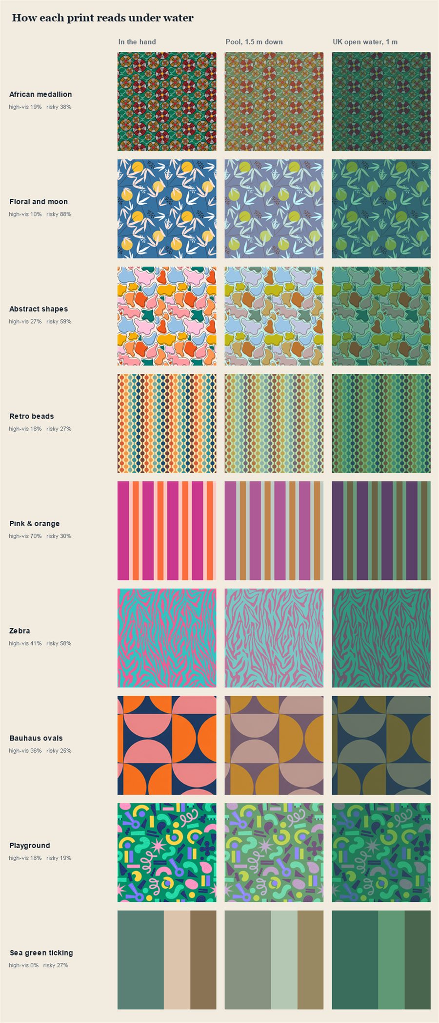
We modelled all nine of our prints on a child at depth, in a pool and in British open water. The most common colour in children's swimwear turned out to be close to invisible.
Swimwear colour is not a safety device. It does not prevent drowning, it does not replace supervision, and no colour makes a child safe in water.
What a high-visibility colour does is narrower and worth having: it shortens the time it takes an adult who is already looking to find a child under the surface. That is the whole claim. Anything more than that is being sold something.
We were choosing prints for a first range and wanted to know how they would read in water rather than on a screen. The answer changed which prints we shortlisted, and it contradicted what most children's swimwear is actually made in.
Water does not dim colours evenly. It absorbs red wavelengths fastest, then orange and yellow, leaving blue-green light to travel furthest. At the same time the water column itself adds a veil of its own colour over everything behind it. So a garment at depth is not simply a darker version of itself — it shifts hue, loses contrast against the water, and can end up the same colour as the background it needs to stand out from.
Three things, in order of how much they matter.
It is the colour of the water, the colour of most pool floors, and the colour a very large share of children's swimwear is made in. In our pool model the blue-ground print turned the same blue-grey as the water around it; in open water it went dark teal and the pattern stopped reading altogether.
Cream, pale pink, washed-out pastels — these read as sunlight, foam and the pale floor of a pool. A print that was 41% pale ended up harder to pick out than a much darker one, because the pale areas merged into the bright background rather than the dark one.
They stay distinct against both a pale pool floor and dark open water, which is the property that matters — a colour that only works against one background is not much use when you do not get to choose the background.
Share of each print's area falling into colours that read well under water, against colours that disappear into it.
These are the nine prints in our own first range, measured from the real artwork. We have described them by colour and pattern rather than named them, for two reasons: they have not been revealed yet, and a description is more use to you than a name — you can hold it against something already in a drawer.
| Reads well | Disappears | |
|---|---|---|
| Hot pink and orange, wide stripe | 71% | 25% |
| Bright orange motif, dark green ground | 37% | 0% |
| Pink and orange geometric on navy | 36% | 23% |
| Scattered bright shapes on mid-green | 23% | 25% |
| Warm earth tones on cream | 17% | 26% |
| Red, gold and white detail on green | 14% | 27% |
| Muted green and cream, fine stripe | 0% | 15% |
| Pale blue and white, small repeat | 0% | 97% |
| Navy with a small white motif | 0% | 100% |
Three of the nine score zero, and we have published that rather than quietly leaving them out.
The pale blue one is the interesting case, and it is why we now think this table is only half the answer. By area, 97% of it falls into colours the research rates badly — it is almost entirely pale blue and white. In a bright pool with a pale floor that is exactly right: we modelled it as the hardest of all nine to pick out. But in silty green British open water the same print was the easiest, because pale against dark water is about as visible as a print can be.
The colour bands everything above is scored against come from drowning-prevention research, and that research is largely built around swimming pools — where white and pale read as sunlight, foam and tile. Dark British open water is a different problem with a different answer. Which water a child is in changes the ranking more than which print you bought.
You do not need any of this modelling to check a swimsuit sitting in a drawer.
The most useful thing we can tell you: if a child is going in open water, a fluorescent colour beats everything here. Fluorescent dyes re-emit absorbed light, so they can appear brighter than the light falling on them — a different mechanism from simply being a saturated colour, and one no ordinary print can match. None of our prints are fluorescent. If visibility is your main concern, buy fluorescent, from whoever makes it.
We took the actual print artwork — the real tile files that go to the printer — and did two things with it. First, we scored every pixel into colour bands drawn from the published guidance: reads well, reads as water, reads as pale. That is the table above, and it is a measure of the cloth in your hand. Second, we applied standard light attenuation over a two-way path — surface down to the garment and back up — added the veiling light of the water column, and measured how far the result still sat from the water behind it. Two scenarios: a clear pool with a pale floor at 1.5 m, and silty green open water at 1 m.
Each print is drawn at its real size. Every one is rendered across the same 280 mm of cloth — the front of a size 5–6 — so a 35 mm repeat appears eight times and a 300 mm one does not complete once, exactly as a child wears them. Each view is then blurred to roughly the detail an eye can resolve at that distance, so a fine print averages toward a single colour and a bold one does not.
This is a model, not a pool test. Real water varies enormously with silt, season, weather and light. The attenuation coefficients are illustrative values for two water types, not measurements of any particular place.
It also cannot represent fluorescence at all, which understates how much better a true neon would be than anything shown here.
Corrected 23 September 2026. An earlier version of this page said print scale was not modelled. It is now, and adding it changed the answers — the fine green stripe survives better than we expected, because its bands are just wide enough to stay separate, while a small motif on a navy ground averages away into it. The figures on this page are from that run, and they replace an earlier set measured on a line-up that has since changed. The resolution figures the blur uses are our assumption, not a measurement: acuity underwater depends on how silty the water is, and we did not measure that.
The underlying finding is not ours and we would not want it read that way. That fluorescent pink, orange and green read best under water — and that blue and white are the worst — is well established in drowning-prevention research. What we added was running our own prints through it and publishing the result, including the ones that came out badly.
The boldest stripe in the range moved up our list, and it is the one print here that is genuinely easy to spot — 71% of it reads well under water.
We did not drop the ones that scored badly. The quiet green stripe we were most pleased with scores zero on the colour bands, and it is still in the range. So are the other two zeroes. A print is not only a safety device, children have strong opinions about what they will wear, and a pair of shorts a child refuses to put on protects nobody.
What the research changed is how we talk about it. Every print will carry its figures openly, so a parent who wants the most visible option can pick it deliberately — and a parent who wants the quiet blue one can have that with their eyes open.
We are making single-layer swim shorts for children, launching in 2027. There's a list if you want to be told when they exist.
Why swim shorts have mesh liners — where they came from, why so many parents cut them out, and what to look for instead.
What size swim shorts does my child need? — age labels are not measurements, and sizing up tends to make rubbing worse rather than better.
What UPF 50+ actually means — it is a fabric rating measured dry, new and unstretched. A swimsuit in the sea is none of those things.